 |
| don't mind the little head at the bottom of this picture...i think he was taking it all in like i was. :) |
here is the living room (before) in all it's glory. stained carpet (hard to tell in these pics), cheap bi-fold doors, yellowed vents and cover plates and let's not forget the eyebrow like blinds that pretty much fell off the wall.
and here is a view from the entry looking towards the dining room.
dining room looking back towards living room. getting a feel for it? ;)
and the dining room before.
the day we smiled...smelly dirty carpet begone!
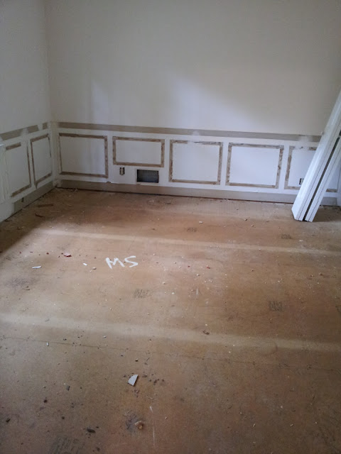
paneling was removed along with the carpet.
so why didn't we keep the paneling, honestly it just was not our thing.
the living room and dining room were the first rooms to have hardwoods installed.
i remember the day we walked into the house...my mouth dropped. they were completely natural meaning no stain and what. a. difference! this is when we got a little giddy.
i think we stood in this room for a long time just soaking in the beauty of the red oak.
then the first coat of stain went on and it was like the house started to come to life.
 |
| a picture of the yellowed wall vent. |
just like the entry, the floors were covered so more of the renovations could take place.
adding the new hardwood floors and baseboard meant we ran into a little bit of a problem. our wall vents were going to run into the baseboard. uh..not cool.
we really didn't want to compromise on the height of the base because of the 9' ceiling height (you know..gotta have good proportions!)
so the carpenters got creative.
the end result, beautifully framed wall vents.
seriously, never thought wall vents would look so pretty.
oh and yes, we did get new vent covers too. why do all that work only to put back the yellowed covers right?
once the floors and baseboards were installed, there wasn't a whole lot to do to these two rooms besides touching up the walls, painting, changing out light fixtures and adding new cover plates.
so these rooms stayed unchanged and covered up for quite a long time,
it wasn't until the week before we moved in that we started to see them transform.
this is what the living room looked like right before we moved in.
ahh...shiny wood floors and a splash of paint!
side note #1: yes, that is a pedestal sink in front of the fireplace.
the flooring guys put it on the marble hearth so that they could put the last coat of poly on the floors. the pedestal was for our powder room which also received wood floors.
this meant that the installation of the sink had to wait until after the floors were done.
here is another picture of the living room....kind of dark so i apologize.
both rooms were painted the same color, Benjamin Moore's Gray Owl.
i used this paint color through out the house to
1. save money
side note #2 - having painters paint your entire house (ceilings, walls, trim and doors) can start to get really expensive really quick when you introduce multiple colors and multiple sheens.
and
2. to have continuity
am i glad i did used only three colors in my house?
yes, but i will say there is a room or two that i wish i would have had it painted white instead
but that doesn't make me any less happy with my decision.
obviously, things have changed since these pictures but we are still working on all the rooms and we aren't quite ready to share progress pictures...just yet. maybe in a week or two.


4 comments:
All I can say is-WOW, the floors are beautiful, and like the new light fixtures, too, and the color of paint!!!!
Looking gorgeous!!
-Thinking about a similar color for our Master bedroom.
d, it is crazy what removing the carpet and painting the walls did, then the little things like the vent covers, cover plates and having the crown/base painted a different color than the wall really helped make them pop and be noticed finally. our house looks good!!! b.
love the paint color! was going to ask!!!! love the vents! great job, creative contractors! ;) really, in the 'before' pic with the paneling, the part with the outlet & the vent kind of did make me squirm. and i thought "is that really how you do that?' - just make the paneling go ABOVE that & not have continuity with the other size & shape of the entire room?!?! i was really confused ... and so i was pleasantly SURPRISED that not only did you take the paneling OFF, thus removing that awkward section - but your contractor got all pretty with the vent! WOO HOO LOVE IT! :)
Post a Comment